BYU Student Author: @Hyrum
Reviewers: @Donovon, @Erick_Sizilio
Estimated Time to Solve: 20 Minutes
We provide the solution to this challenge using:
- Python
Need a program? Click here.
Overview
You and your friend just returned from a game-changing talk about smart investing, and you’re feeling invigorated and ready to start your investment journey. But you’re not going to settle for just any kind of investing - you want to do it the smart way.
You and your friend decide to take on the ultimate challenge and investigate some companies. Your goal? To find the best investment opportunities and earn passive income like a boss!
You come across a spreadsheet filled with data about different companies, and you’re eager to start analyzing. But there’s a catch, you don’t have the fancy software like Tableau or Alteryx to make the kind of graphs you want. But don’t worry, you’ve got a secret weapon: your top-notch python skills!
With determination and a can-do attitude, you start creating some seriously impressive tables in Python. You’re not going to let a lack of resources hold you back - you’re going to make this happen no matter what.
As you work, you can feel your excitement growing. You’re learning new things, honing your skills, and taking control of your financial future like a pro. And when you’re finished, you’ve got some seriously impressive visualizations that are going to take your investment game to the next level.
Instructions
Upload the datasheet from the link as a DataFrame and fill all the null values with 0. Then make the following graphs.
-
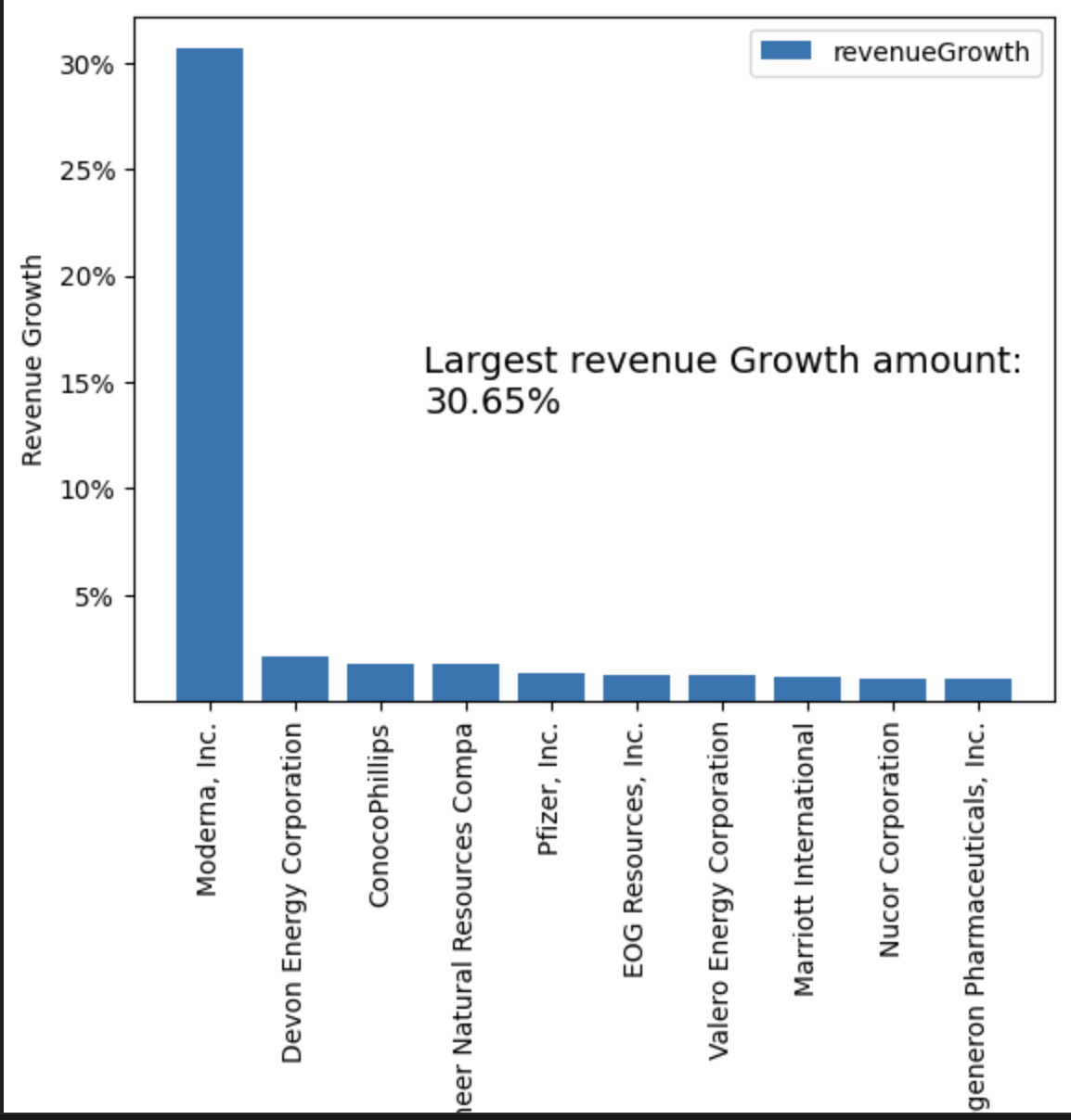
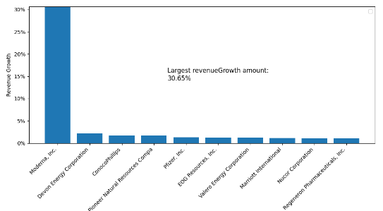
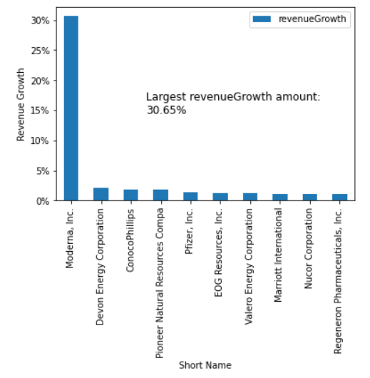
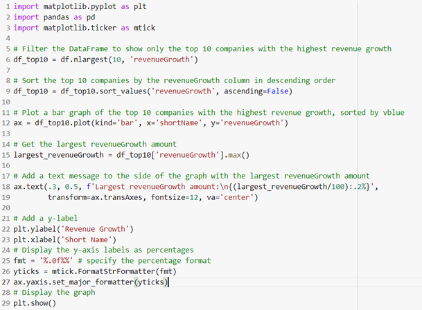
Make a bar graph that shows the top ten revenue growth companies with their revenue growths shown as percentages, like the graph below:
-
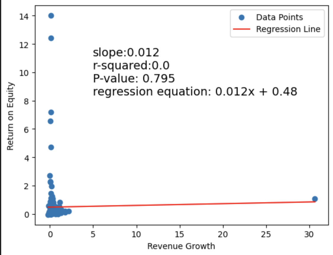
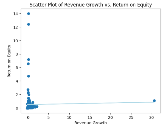
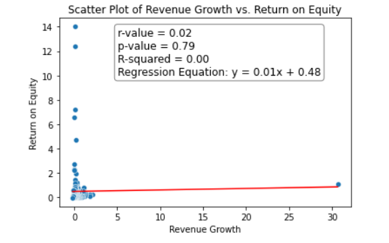
After considering the matter, you may wonder if pursuing revenue growth is the optimal course of action. While revenue growth is typically an indicator of a company’s expansion, it does not guarantee a positive return for investors. As such, it may be beneficial to assess the return on equity, which is a traditional metric used to gauge investor returns. To evaluate the relationship between revenue growth and return on equity, a regression analysis can be conducted. Conduct that regression analysis by making a scatterplot and making a regression line through it.
-
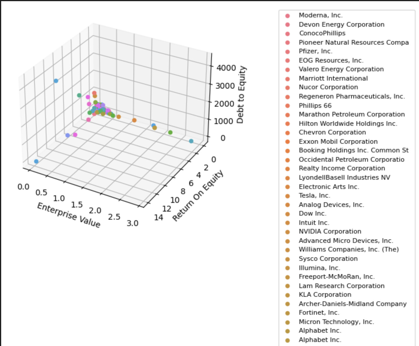
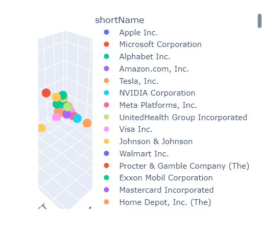
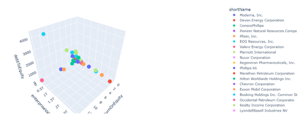
You have decided to gather additional information and have concluded that return on equity is more critical than revenue growth information. While revenue growth can provide insight into a company’s future, it may not have a direct impact on you as an investor. Therefore, you have chosen to focus on evaluating return on equity, enterprise value, and debt-to-equity measures. You plan to analyze all three measures simultaneously by creating a 3D graph with these metrics as the different axes. Additionally, you plan to use the short name of the company as a color-coding mechanism to differentiate them on the graph.
Data Files
Suggestions and Hints
Use matplotlib, pandas, seaborn, numpy, scipy.stats, plotly.express
Here are some resources that can help with the application of these codes:
- How to Create a Bar Chart in Python using Matplotlib – Data to Fish
- Learn how to create beautiful and insightful charts with Python — the Quick, the Pretty, and the Awesome | by Fabian Bosler | Towards Data Science
- 3d scatter plots in Python
For the bar graph, follow these steps:
- Filter the DataFrame to show only the top 10 companies with the highest revenue growth.
- Sort the top 10 companies by the revenueGrowth column in descending order.
- Plot a bar graph of the top 10 companies with the highest revenue growth, sorted by value.
- Get the largest revenueGrowth amount.
- Add a text message to the side of the graph with the largest revenueGrowth amount.
- Add a y-label.
- Display the y-axis labels as percentages.
- Display the graph.
For the regression analysis, follow these steps:
- Create the scatter plot with seaborn.
- Add axis labels and title.
- Calculate the linear regression line using scipy.stats.linregress.
- Plot the linear regression line.
- Plot the r value, p-value, r square value, and linear regression equation on the image as text.
- Show the plot.
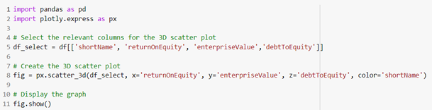
For the 3-D graph, follow these steps:
- Select the relevant columns for the 3D scatter plot.
- Create the 3D scatter plot.
- Display the graph.
For further hints, here is what the second two graphs are meant to look like:
Solution
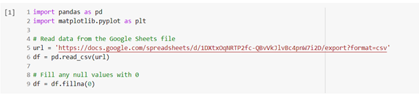
Upload the datasheet as a DataFrame and fill all the null values with 0.
Bar Graph
Regression Analysis
3-D Graph
Solution Video: Challenge 96|PYTHON – Investment Visualization